Android Wear 2.0 has taken an important lesson from the Apple Watch
Opinion: Less screen time is good for Google
As the saying goes, less is more, and Google has apparently been listening. Android Wear 2.0 does a lot of good things, but its greatest strength in is what it doesn't do. It's about spending less time touching, tapping and swiping, and more glancing and not touching the screen at all.
This is where Android Wear 1 was fundamentally broken in my opinion: It did some good things, but too often I felt like I had a demanding child clamped around my wrist, continually bugging me for things I didn't need to know about.
And the swiping. Oh God the swiping. Endlessly throwing aside notification cards almost to the point I felt like I could imitate the motion on the dance floor and people would say, "Hey look, he's doing the Android Wear!"
The verdicts are in: LG Watch Sport review | LG Watch Style review
The good news is that Android Wear 2.0 has learned why much of this was wrong and come back with something more refined and less intrusive.
If you're familiar with the Apple Watch then you'll immediately see some shared ideas here. That's not to say Apple "invented" these things, and a comparison of watchOS2 and OS3 demonstrate that Cupertino took time to grasp the smartwatch use case. But it was faster to understand how people want to use their smartwatches.
You know what? Sometimes physical buttons are a good thing
These days, the Apple Watch lets you do a lot without touching the screen at all, and Wear 2.0 imitates this. I think complications and support for rotational input best demonstrate the point here.
Complications, a feature of traditional timepieces, add widgets to your watch face, and in smartwatches can do everything from displaying your next calendar appointment to the outside temperature. App developers will be the ones building these in, and so far I've only had access to a limited few, but I'm excited to see what people do with them.
The benefit here is that you can instantly access information at a glance without having to go into an app, which saves time and negates any need to touch the watch at all.
Dialling it down
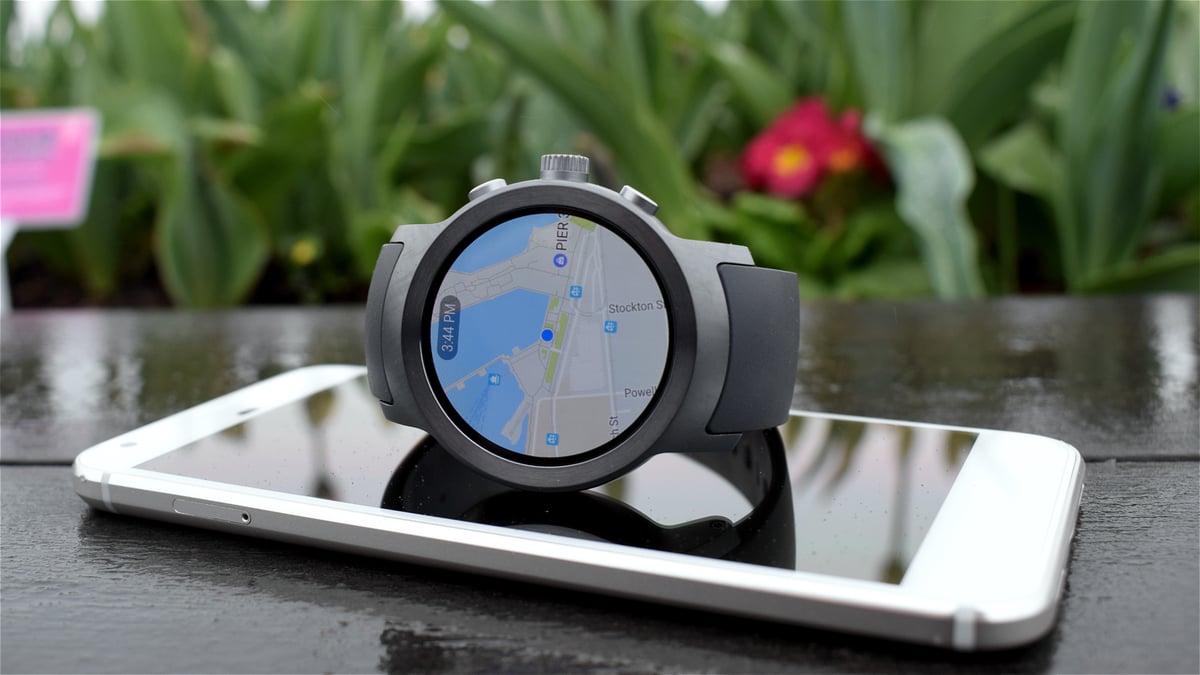
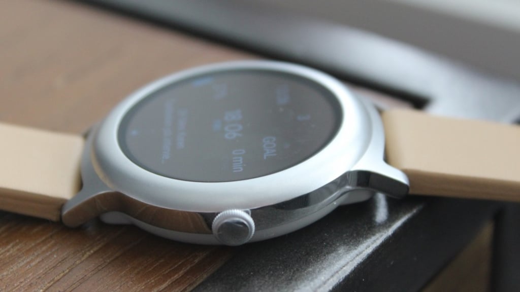
Second: rotational input. I've been using the LG Watch Sport for a little over a week and I'm still finding great joy in gliding about with its version of the digital crown. I find this is a much more intuitive way of using a device where screen space is limited and fingers often cover information. It's all too easy to tap the wrong thing, or swipe slightly too aggressively, which can often make the smartwatch experience more frustrating than useful.
The crown is also, ostensibly, an admission from Google that it forgot one of the things that makes a good smartwatch good: imitating an actual watch. Because you know what? Sometimes physical buttons are good. The Wear team told us the new input support opens up the possibility for more rotating bezel mechanisms like Samsung has on its Tizen-running Gear S3 (which is great, if you haven't used it).
Upgrade: When will your smartwatch get Android Wear 2.0
And when you do want to want to do more than glance, support for standalone apps means there's a lot less redirecting you to your phone, which means, again, less demand for input. In this case that has been fishing your phone out of your pocket and wondering why you bothered going via your smartwatch in the first place.
Android Wear 2.0 isn't perfect; neither is watchOS. Both are still learning their place on our wrists. But both have evolved with the knowledge that when it comes to smartwatches, people want them to be less demanding. Apple might have been faster to get there, but it doesn't matter now that Google has finally caught up.