
An innovative hybrid smartwatch concept that bites off more than it can chew
The MyKronoz ZeTime promises plenty on paper, but for the most part it isn't able to meet its own lofty standards. In short, the device is a frustrating one; there's plenty of potential here that just isn't met. Glaring issues exist within design, while the Swiss company's own operating system feels very much like an amateur operation. There are flashes that give hope, and we still love the overall concept, but there are lessons to learn from and room to grow with this smartwatch in hybrid clothing. Until then, this is a hard one to recommend, despite the relatively budget price.
Pros
- Strong battery life
- Great custom faces
- Mechanical hands work well
Cons
- Half-baked OS
- Infuriating touchscreen
- Tracking is limited
It’s been roughly a year since Swiss startup MyKronoz took to crowdfunding circles and raised the most money ever seen by a European company, with its ZeTime hybrid smartwatch beginning its rollout to backers just before the turn of the year.
Like in every other area of the tech industry, there are plenty of wearable startups that don’t meet the mark. Prices can often be too high when compared to more reliable alternatives, designs can often feel cheap compared to the premium tier, and, simply, many just don’t do enough differently to encourage a shift off the usual path.
The latter doesn’t apply to MyKronoz, whose ZeTime is a device that, on paper, provides the best of two worlds: mechanical hands help it act as a hybrid, while the touchscreen underneath means it can also function as a more standard smartwatch.
Read this: MyKronoz boss Boris Brault talks redefining hybrids
Since the ZeTime first rolled onto the scene, we’ve seen Garmin offer a similar mixed smartwatch experience through its Vivomove HR, but this is still a concept which leaves MyKronoz in uncharted territory. So, as it looks to bring innovation to the smartwatch space, does the ZeTime sink or swim? We’ve been living with the device for the past few weeks in order to find out.
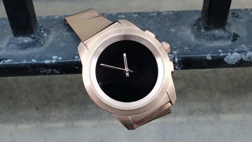
MyKronoz ZeTime: Design
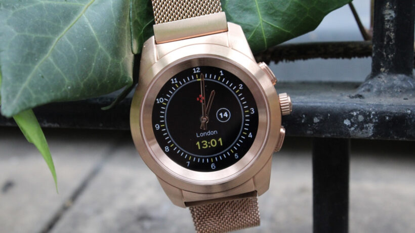
As we say, the big thing to note here is the mechanical hands over the touchscreen interface. And while we’ll come onto that area of the design and how it performs, let’s talk a little about the other aspects of this watch.
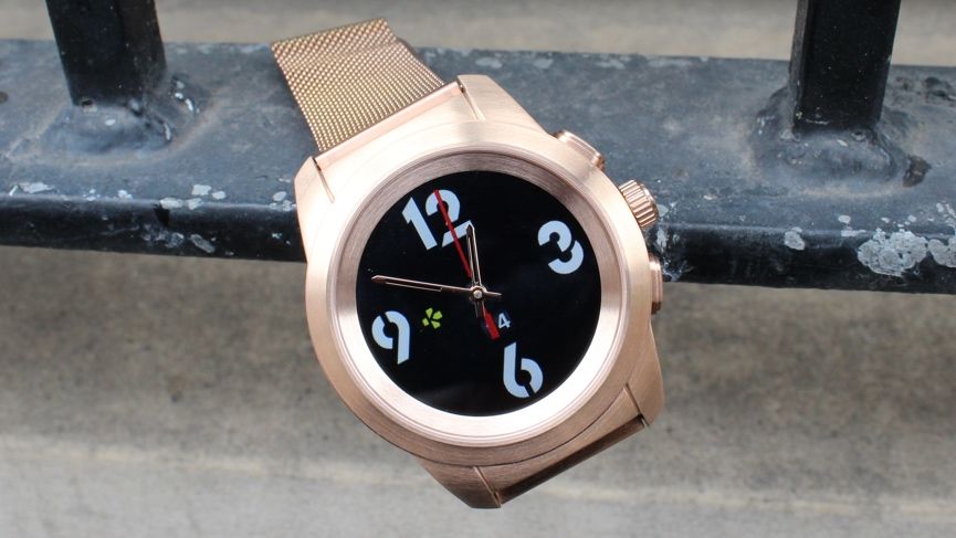
MyKronoz’s ZeTime gives you a fairly standard 44mm bezel, which I’ve found fits nicely on the wrist, but those looking for something slimmer can also explore the Petite, 39mm variant. It’s also not too thick, meaning there isn’t a struggle to get it underneath jackets or shirts. But while everything is fine to look at, this stainless steel bezel is a seriously weighty customer. Clocking in on the scales at around 90g, this is around double the weight of something like Apple’s stainless steel Series 3 model.
It’s hard to ignore, and not just when you first pick up the device. Our unit happened to be a model which comes with a Milanese loop strap, instead of the leather options also available to switch into, and this only accentuated the problem.
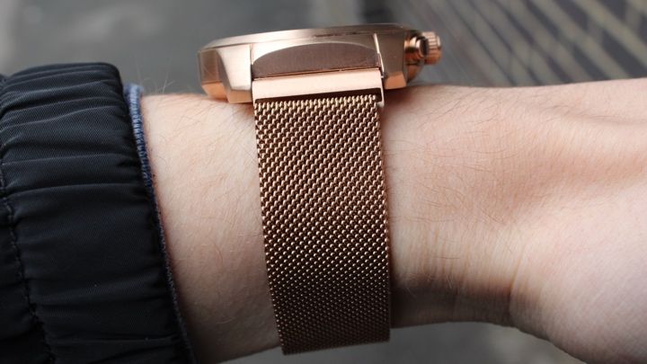
Since this band keeps things in place through a magnet, we often found the bezel was too heavy for the strap, meaning it would come loose as soon as you had any significant hand movement. And when you’re wearing this all day, constant readjusting is a major headache. If you’re considering the metal strap, we strongly advise picking up a leather variation instead (which we tried during a briefing back in September) to keep things locked in.
Aside from this, we’re actually impressed with the look and feel of the device. The rose gold option I’ve been sporting for the past couple of weeks has raised some eyebrows, no doubt, but generally there have been more good comments than bad. If the jazzy gold is too much, the bezel also comes in silver and black.
All in all, it’s a device we haven’t hesitated reaching for over a lot of watches from bigger brands, and a lot of that has to do with the versatility the mechanical hands bring to the design. Usually my eyes are drawn to the time on the screen, rather than the hands, but they definitely contribute to the overall look, giving you a much friendlier alternative to a blank face, and much more power efficiency than an always-on touchscreen.
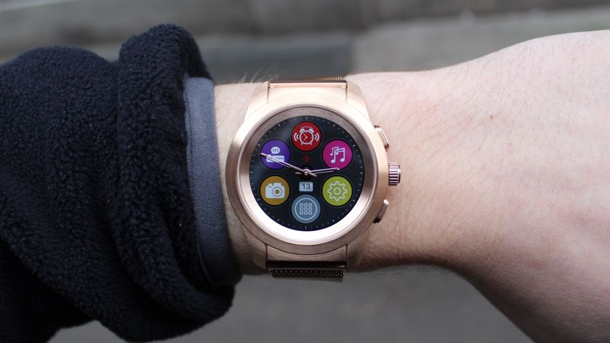
Setting these hands up through the MyKronoz companion app (available for both iOS and Android) isn’t too much of a hassle, and can be readjusted from the watch itself if things aren’t matching. Interestingly, these hands are also smart, adjusting around the text you see on the touchscreen face underneath. If you open up your recent notifications, for example, the hands will spin to 3 o’clock and 9 o’clock and the underlying text will sit out of their way. Once you exit a mode that makes use of this, the hands spin back to the time and you can continue roaming through the watch. It’s a simple touch, but it works nicely when you have a long notification come through.
But you don’t have to navigate purely through the touchscreen (and you won’t want to, the glare-ridden ZeTime attracts fingerprints unlike any other watch I’ve used), since two buttons and an interactive crown also rest on the side of the watch. The top pusher essentially acts as your wake/sleep button, while also sending you back to the watch face if you’re in the menus. The crown, meanwhile, can be twisted in order to scroll through notifications, menu screens and more, and a double tap will present you with a minimalist outline of the mechanical hands. The bottom shoots you back a step on the menu, while also waking and sleeping the watch.
So, navigation is a cinch? Well, not exactly. While the ZeTime can convincingly work the mechanical hands look, its touchscreen interface is less successful. Swiping doesn’t feel responsive, and more often than not you’ll have to repeat a tap in order to actually move through the watch. Even when you do manage to get through to the watch, your movements act as jump-cuts rather than traditional, responsive menu-swiping. Whatever premium feel the device builds up through its design is swiftly killed when you try and use your hand to interact with the proprietary operating system.
And it’s not just poor interaction through the TFT colour display, it also just isn’t very clear, despite the 1.2-inch screen clocking in a resolution of 240 x 240 pixels. If you look close enough, particularly on lighter backgrounds, you can spot pixels, and the feel is just very amateur.
MyKronoz ZeTime: Features
While we can’t exactly vouch for the ZeTime’s mixed bag in the design department, it does help you interact with the features working under the hood. And what you have here is round-the-clock tracking, whether it’s covering extent of your daily activity or your nighttime hours. It’s not the most comprehensive – you won’t be able to take this out on runs and get real-time feedback (or the pool, despite its 5ATM water rating) – but it does cover a lot of bases that those looking for the basics will want.
Let’s kick things off with heart rate monitoring, which users are only able to track every 5-30 minutes. Your minimum and maximum heart rate are also set through the ZeTime app, not automatically when inputting age and weight, with all the data collected then fed back to give you a look at how your ticker performed throughout the day.
Because this isn’t continuous tracking, though, it builds up quite a bizarre picture of your heart, presented in the app almost like a sleep graph in which the user experienced an unrelenting fever dream. This obviously gets better the more often the device checks in for a heart reading, but it’s still not the best way to receive heart rate insights, in our book. And when we have managed to compare the heart rate accuracy to other smartwatches, it’s consistently undershot the numbers.
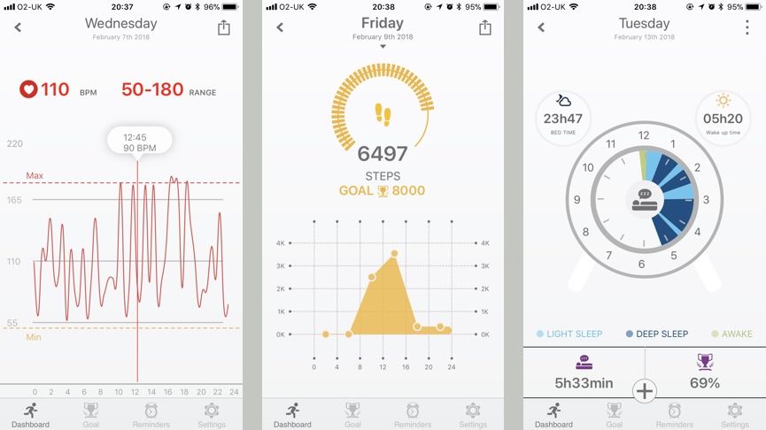
These aren’t the only problems, either. Viewing your weekly or monthly data is anything but easy, with no indication of which days the device was active and no way to easily swipe between days. And sadly, this is a theme which sticks, whether you want to view your calories, steps, active minutes or sleep data.
Speaking of sleep, this tracking also has its inconsistencies. While it’s not completely out whack against a device like the Fitbit Ionic, providing you with info on when you were in light and deep sleep, there have been several times when it has detected us waking up in the middle of the night and then stopped tracking altogether, assuming that our sleep had ended.
Lesser features, such as steps, calories and active minutes aren’t quite as problematic, but this all generally feels like a half-baked approach to tracking.
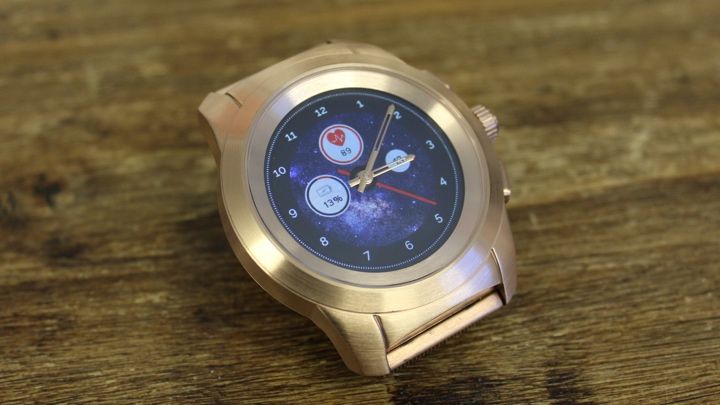
Despite its obvious drawbacks, it’s not all bad. The customisable watch faces are implemented as well as any high-tier smartwatch on the market. Not only are there a ton of pre-set faces to choose from, ranging from digital options to more classic timepiece variations, but making a face from a template or one of your own photos is simple, fun and always leaves the device looking fresh.
Take the example above, in which we were able to customise the dial, widgets, background layer and even second hand. Once you’re done creating your masterpiece on the app, you can preview it and then upload to the watch for easy switching in the future.
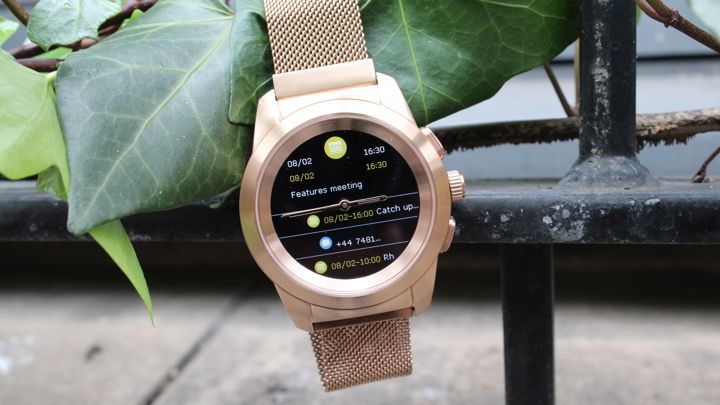
Reminders are also another feature that, while basic, are done well through the ZeTime and the companion app. You can set a buzz for pretty much everything, and at any time. Need to take medicine every morning? You can get a reminder for that. Always forgetting to pay your rent or other bills? You guessed it, you’re covered. And naturally, this is also the case for the likes of sleep, meetings and activity.
MyKronoz ZeTime: Battery life
Since this is technically a hybrid smartwatch, you’d expect battery life to be better than the average smartwatch here. MyKronoz claims that users can expect up to 30 days in its watch mode, while the always-on smartwatch mode will give you three days.
We haven’t had chance to test out the full strength of the battery, but we can confirm that it’s impressive. After wearing the device in its standard mode around the clock for roughly a week, with heart rate being tracked every half an hour and consistent syncing to the companion app, it only lost around 30% of its battery. And when we amped things up to the smartwatch mode, it actually outlasted the company’s estimation of three days – lasting until the evening of the fourth day before we broke out the charging puck.
Of course, battery life can vary dramatically depending on a myriad of different settings, but this can definitely be classed as a strength of the ZeTime. And since this can sparingly become a smartwatch, that’s mightily impressive. We only wish it was backed up better in design and features.


: Top scales for iPhone users")